Designing a B2B product suite connecting insurers, providers, and patients
The challenge
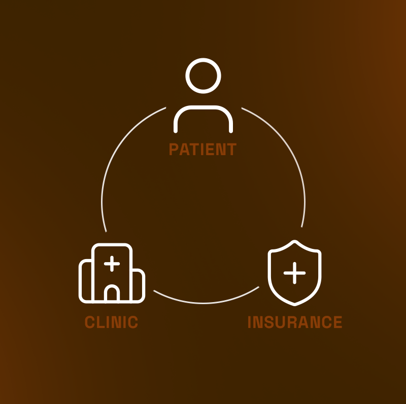
Patients, insurers, and healthcare providers were operating in disconnected systems. Patients paid upfront without knowing what was covered, providers managed services without visibility into insurance requirements, and insurers handled claims with limited context from either side.
Viveo set out to bring these parts together through a connected B2B platform that could support the full journey. As Lead Designer, I worked closely with the CEO and engineering team to define and design a suite of products that allowed each group to manage their role while keeping the overall experience aligned.
What wasn't working
Iterative, data-driven phases
Rather than a single big redesign, we shipped in focused phases -- each monitored through FullStory session recordings to validate impact before moving on.
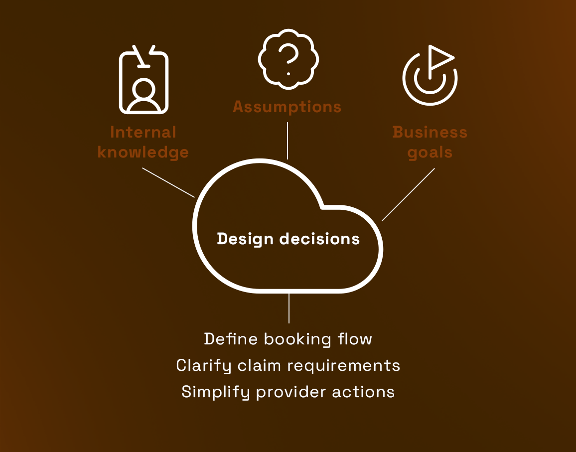
Defining the system
The product direction had shifted, but there was no clear definition of what the B2B platform should be or how the different users would interact.
Created a shared understanding of the product as a system, not a single tool, which helped guide all future decisions.
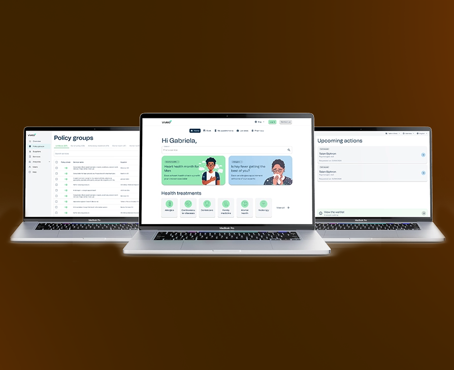
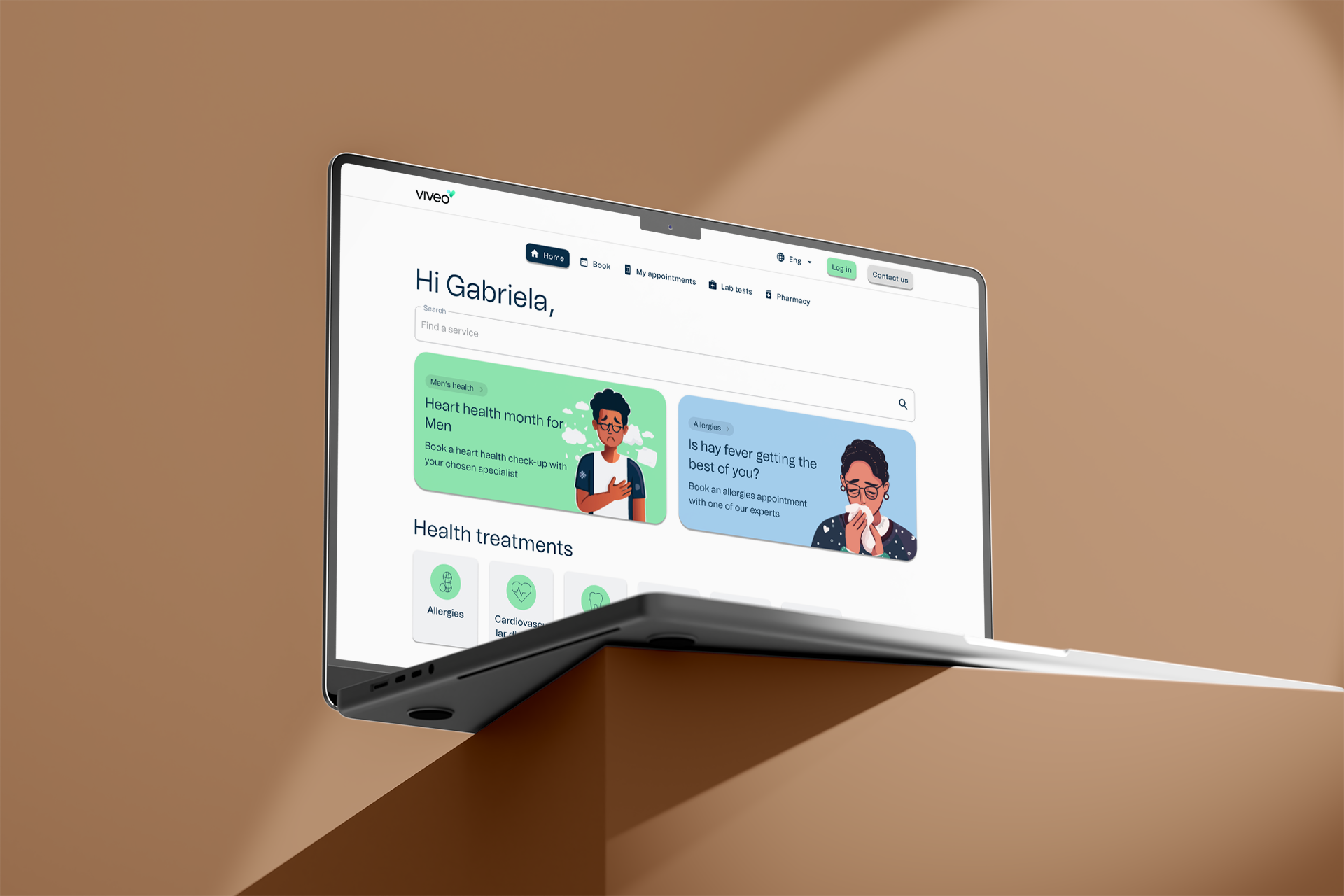
Designing the first product
We needed a clear starting point to validate the direction, but the full system was too large to design at once.
Established a tangible product that made the overall vision easier to understand and validate.
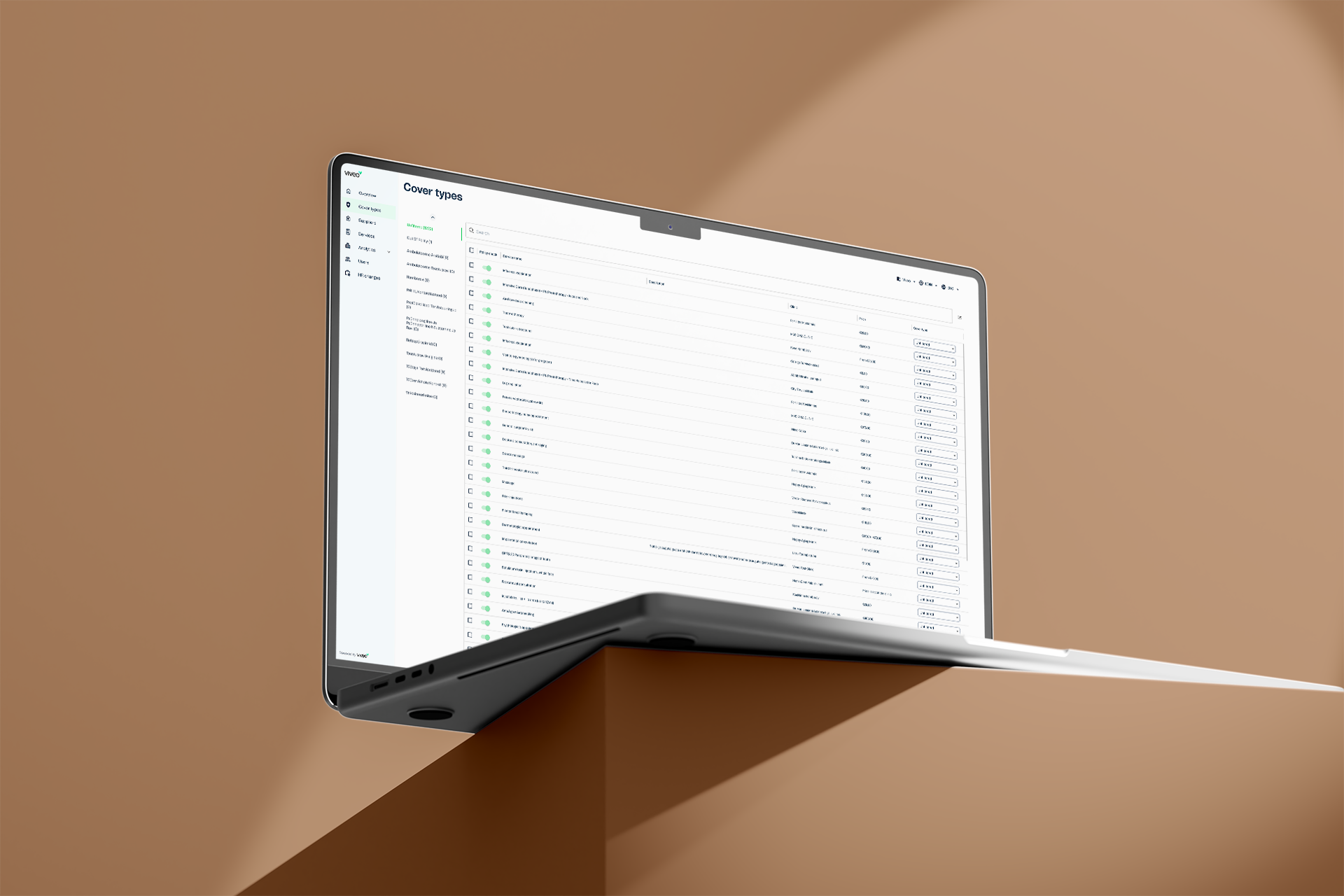
Expanding into back office tools
The patient experience could not function without tools for insurers and providers, but requirements for these were unclear.
Uncovered key requirements through design, allowing the product to evolve without needing fully defined specifications upfront.
Working without direct user access
We had limited access to real users in the early stages, making validation difficult.
Maintained momentum and avoided blocking development, while creating a foundation for future user validation.
Aligning the product suite
As more tools were developed, inconsistencies started to appear across products and user experiences.
Created a more cohesive product suite where each tool felt connected and easier to use across different user groups.
What I took away
Ship before everything is defined
Progress came from making decisions visible. Designing flows and screens helped uncover gaps faster than waiting for full requirements.
Use design to drive clarity
When direction was unclear, design became the tool to shape conversations. Showing something concrete made it easier for the team to react and align.
Consistency matters across systems
Designing multiple products is not just about individual usability. The real challenge is making everything feel connected and predictable across the full journey.