Simplifying healthcare booking across a complex patient platform
The challenge
Patients across Estonia were navigating a fragmented healthcare system. Finding providers, understanding pricing, and booking appointments often required switching between multiple platforms with little clarity.
Viveo set out to unify this into a single booking experience. As Lead Designer, I helped evolve the platform from a B2B foundation into a patient-facing product, working closely with leadership to shape both the user experience and product direction.
Key usability and trust barriers
Iterative, data-driven phases
Instead of a single large redesign, the platform was improved in focused, iterative phases. Each phase was validated through FullStory session recordings to ensure real user impact before moving forward. The work was shaped by evolving product direction and existing technical constraints, which required careful prioritization of features and design decisions.
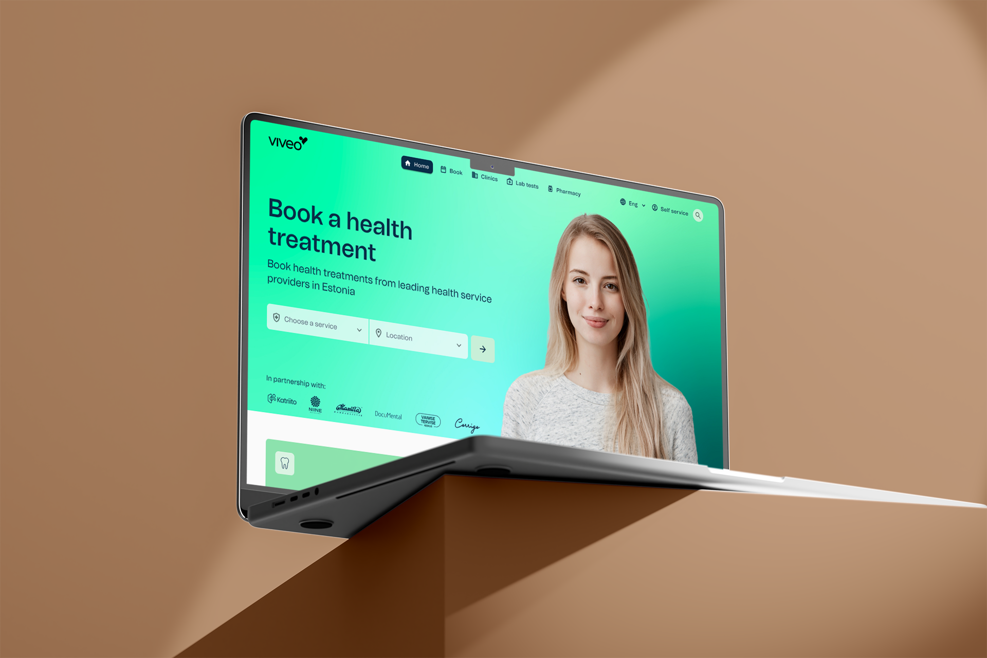
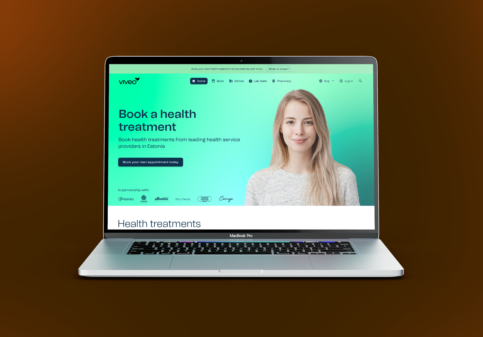
Establishing a functional brand identity
The whitelabel B2B interface lacked a clear brand presence, leaving patients without trust signals at first glance.
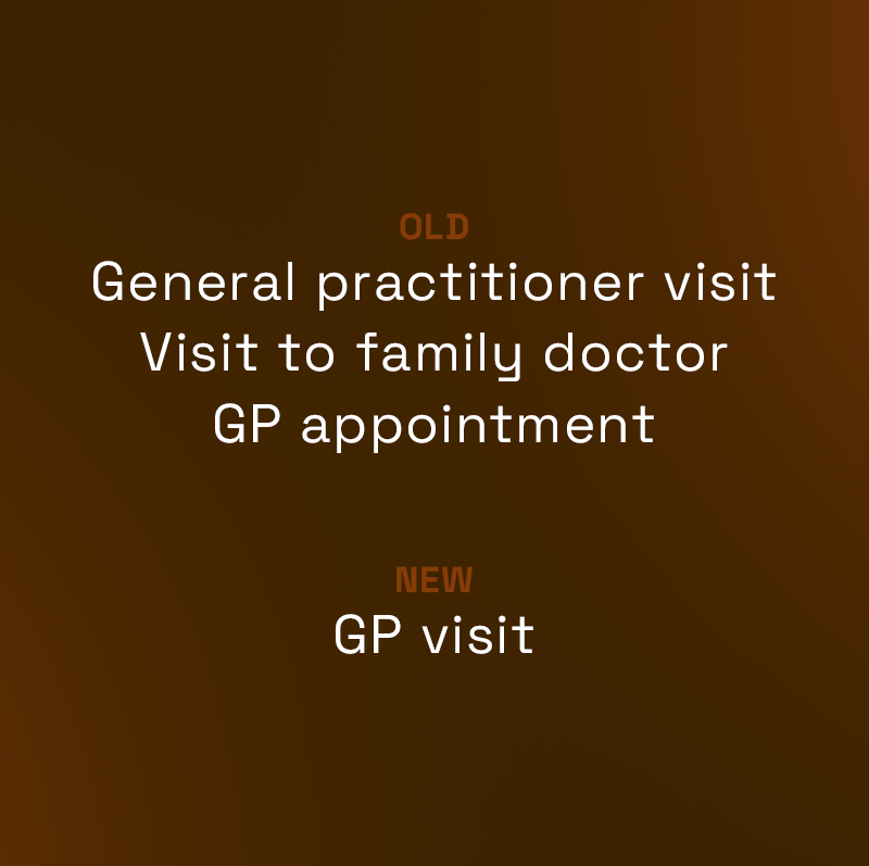
Reducing cognitive load for users
Duplicate and inconsistent service names across providers made the selection process confusing and overwhelming, increasing the risk of user drop-off.
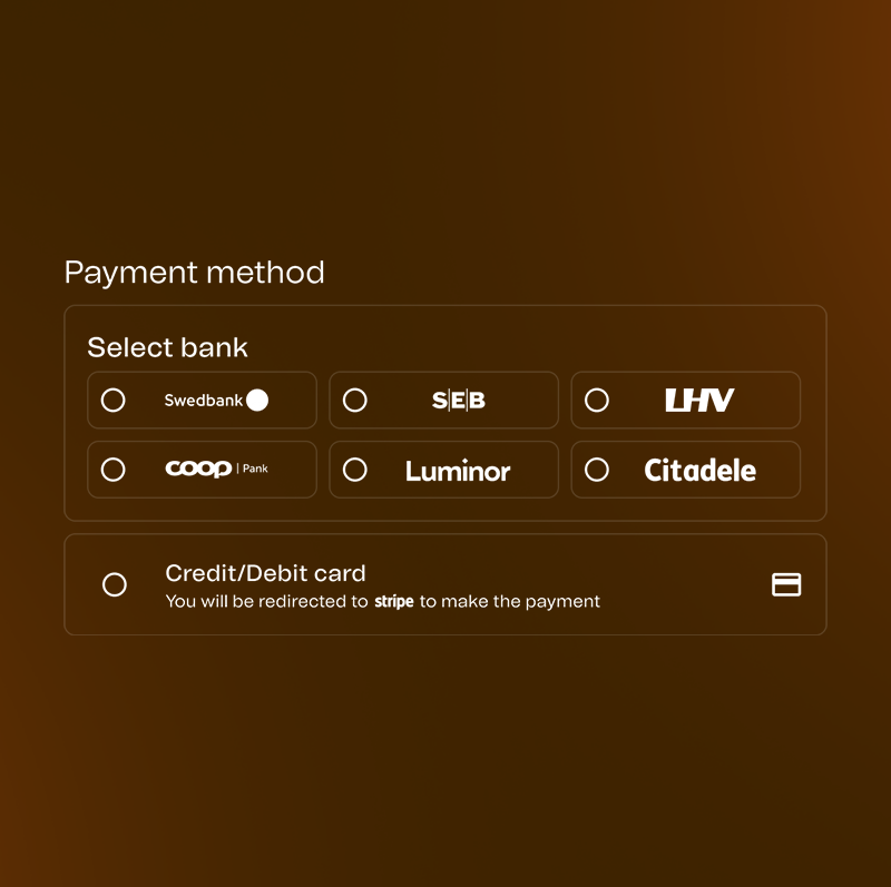
Improving payment and service visibility
Checkout was a major conversion bottleneck, and key services were difficult to find within the navigation, limiting user engagement.
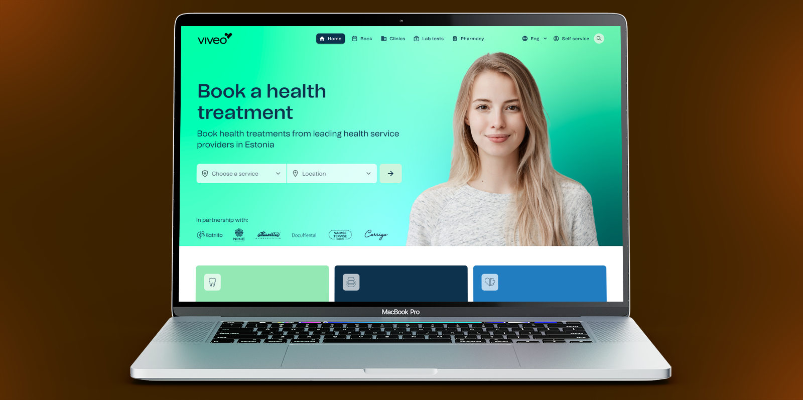
Search-driven booking redesign
Users continued to struggle with finding location-relevant services efficiently, and the hero section was not effectively guiding their actions.
Key learnings and impact
This project highlighted how critical early alignment with engineering is. Limited feedback loops made iteration slower, so I focused on simplifying decisions and validating through outcomes rather than continuous input.
Ship fast, learn faster
Pre-launch testing wasn’t enough in this environment. Shipping to real users with FullStory provided more actionable insights than controlled usability tests, allowing us to validate decisions quickly and iterate based on actual behaviour.
Bridge the team gap early
Limited feedback loops with engineering made early alignment critical. Establishing phased releases, clear documentation, and shared expectations reduced friction and improved delivery speed.
Planning enables pivoting
The absence of a clear structure early on made it difficult to respond to changing priorities. It reinforced the importance of planning as a foundation—enabling teams to pivot with confidence rather than reactively.